# 变化
# 2D平移 translate
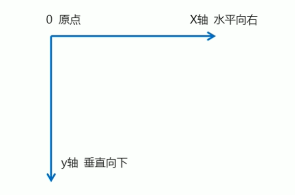
# 二维坐标系
2D转换是改变标签在二维平面上的位置和形状的一种技术,先来学习二维坐标系
2D移动是2D转换里面的一种功能,可以改变元素在页面中的位置,类以定位
- 定义2D转换中的移动,沿着X和Y轴移动元素
- translate:最大的优点:不会影响到其他元素的位置
- translate中的百分比单位是相对于自身元素的translate:(50%,50%):
- 对行内标签没有效果
- 如果使用百分号,移动的距离是盒子自身高度或者高度来对比的
- 对行内标签没有效果
<body>
  <div></div>
</body>

<style>
  div {
    width: 100px;
    height: 100px;
    background-color: red;
    /*
      x就是x轴上移动位置y就是y轴上移动位置中间用逗号分隔
      transform:translate(x,y);
    */
    /*transform: translate(100px, 0);*/
    /*transform: translate(100px, 100px);*/
    transform: translateX(100px);

  }
</style>
# 垂直剧中
<body>
<div>
    <p></p>
</div>

</body>

<style>
    div {
        width: 500px;
        height: 500px;
        background-color: red;
        position: relative;
    }

    p {
        position: absolute;
        top: 50%;
        left: 50%;
        width: 100px;
        height: 100px;
        background-color: blue;
        transform: translate(-50%, -50%);

    }

</style>
# 2D旋转 rotate
2D旋转指的是让元素在2维平面内顺时针旋转或者逆时针旋转。
transform:rotate(度数)
- rotate里面跟度数,单位是deg比如rotate(45deg)
- 角度为正时,顺时针,负时,为逆时针
- 默认旋转的中心点是元素的中心点
<body>

    <img src="../static/img/account.png">
</body>

<style>
    img {
        transform: rotate(50deg);
    }
</style>
# 2D缩放 scale
缩放,顾名思义,可以放大和缩小。只要给元素添加上了这个属性就能控制它放大还是缩小。
transform:scale(x,y);
- 注意其中的x和y用逗号分隔
- transform:scale(1,1):宽和高都放大一倍,相对于没有放大
- transform:scale(2,2):宽和高都放大了2倍
- transform:scale(2):只写一个参数,第二个参数则和第一个参数一样,相当于scale(2,2)
- transform:scale(0.5,0.5):缩小
- scale缩放最大的优势:可以设置转换中心点缩放,默认以中心点缩放的,而且不影响其他盒子
<body>
<div></div>
</body>

<style>
    div {
        width: 200px;
        height: 200px;
        background-color: skyblue;
    }

    div:hover {
        transform: scale(1.1,1);
    }
</style>
# 2D倾斜 skew
语法:transform: skew(x,y);
div {
    transform: skew(20deg, 30deg);
}
<!DOCTYPE html>
<html lang="en">
<head>
    <meta charset="UTF-8">
    <title>Title</title>
    <style>
        .box {
            width: 200px;
            height: 200px;
            position: absolute;
            left: 50%;
            top: 50%;
            background-color: skyblue;
            /*
                倾斜效果
                正的是往左倾斜,负的是往右
            */
            transform: translateX(-50%) translateY(-50%) skew(20deg);
        }
    </style>
</head>
<body>
<div class="box"></div>
</body>
</html>
# 2D中心点 transform-origin
transform-origin:x y;
- 注意后面的参数X和y用空格隔开
- × y默认转换的中心点是元素的中心点(50%50%)
- 还可以给xy设置像素或者方位名词(top bottom left right center)
<body>

<div></div>
</body>

<style>
    div {
        width: 200px;
        height: 200px;
        background-color: skyblue;
        margin: 200px auto;
        transition: all 1s;
        /**
            transform-origin: left bottom;
            默认是center center

         */
        transform-origin: 50px 20px;

    }

    div:hover {
        transform: rotate(360deg);
    }
</style>
# 2D综合写法
- 同时使用多个转换,其格式为:transform: translate() rotate() scale() 等
注意
这里的执行顺序是 先执行最右侧的,从右往左
# 过度 transition
过渡(transition)是CSS3中具有颠覆性的特征之一,我们可以在不使用Flash动画或JavaScript的情况下,当元素从一种样式变换为另一种样式时为元素添加效果。 过渡动画:是从一个状态渐渐的过渡到另外一个状态
可以让我们页面更好看,更动感十足,虽然低版本浏览器不支持(i9以下版本)但是不会影响页面布局。
现在经常和:hover一起搭使用。
语法:
transition:要过渡的属性 花费时间 运动曲线 何时开始;
- 属性:想要变化的css属性,宽度高度背景颜色内外边距都可以。如果想要所有的属性都变化过渡,写一个a‖就可以。
- 花费时间:单位是秒(必须写单位)比如0.5s
- 运动曲线:默认是 ease(可以省略)
- 何时开始:单位是秒(必须写单位)可以设置延迟触发时间默认是0s(可以省略)
# 运动曲线
| 值 | 说明 | 效果特点 |
|---|---|---|
linear | 匀速 | 从头到尾保持相同速度 |
ease | 默认值 | 开始慢 → 中间快 → 结束慢 |
ease-in | 先慢后快 | 动画逐渐加速 |
ease-out | 先快后慢 | 动画逐渐减速 |
ease-in-out | 先慢→中间快→再慢 | 两头慢,中间快 |
cubic-bezier(x1, y1, x2, y2) | 自定义贝塞尔曲线 | 通过控制点控制速度曲线 |
steps(n, start/end) | 分步动画 | 将过渡分为 n 步骤执行,可模拟逐帧效果 |
多个之间用逗号,所有的属性用all
<body>
    <div class="parent">
    </div>

</body>
<style>
    .parent {
        width: 200px;
        height: 200px;
        background-color: skyblue;
    }

    .parent:hover {
        width: 400px;
        height: 400px;
        transition: width 0.5s ease ;
    }

</style>
多个
<body>
    <div class="parent">
    </div>

</body>
<style>
    .parent {
        width: 200px;
        height: 200px;
        background-color: skyblue;
    }

    .parent:hover {
        width: 400px;
        height: 400px;
        transition: all 0.5s ease, height 0.5s ease;
    }

</style>
# 3D转换
# 三维坐标系
三维坐标系其实就是指立体空间,立体空间是由3个轴共同组成的。
- x轴:水平向右 注意:X右边是正值,左边是负值
- y轴:垂直向下 注意:y下面是正值,上面是负值
- Z轴:垂直屏幕 注意:往外面是正值,往里面是负值
注意
3D效果需要在父容器上设置 preserve-3d
div {
  transform-style: preserve-3d;
}
# 3D 转换 透视 perspective
在2D平面产生近大远小视觉立体,但是只是效果二维的,如果想要在网页产生3D效果需要透视(理解成3D物体投影在2D平面内)。模拟人类的视觉位置,可认为安排一只眼睛去看
- 透视我们也称为视距:视距就是人的眼睛到屏幕的距离
- 距离视觉点越近的在电脑平面成像越大,越远成像越小透视的单位是像素
- 数值越小,透视效果越强
- 父元素添加,所有子元素都会添加透视效果
- 子元素添加,当前元素拥有透视效果
注意
perspective()必须作为transform属性的第一个函数(否则无效)
<body>

<div></div>

</body>
<style>
  body {
    /*透视写在被观察元素的父盒子上面*/
    perspective: 100px;
  }
  div {
    width: 200px;
    height: 200px;
    background-color: skyblue;
    transform: translateX(100px) translateY(100px) translateZ(0);
  }
</style>
# 3D移动 translate3d
3D移动在2D移动的基础上多加了一个可以移动的方向,就是轴方向。
- translform:translateX(10Opx):仅仅是在x轴上移动
- translform:translateY(100px):仅仅是在Y轴上移动
- translform:translateZ(10Opx):仅仅是在Z轴上移动(注意:translateZ一般用px单位)
- transform:translate3d(xy,z):其中X、y、Z分别指要移动的轴的方向的距离
<body>

<div></div>

</body>
<style>
  div {
    width: 200px;
    height: 200px;
    background-color: skyblue;
    transform: translateX(100px) translateY(100px) translateZ(100px);
    /*
      trans1ateZ行着Z轴移
      translateZ后面的单位我们一般跟px
      translateZ(1gpx)向外移动1o8px(向我们的眼睛来移动的)
      3D移动有简写的方法
      transform: translate3d(100px,100px,100px);
      xyz是不能省略的,如果没有就写0
      transform: translate3d(0,100px,100px);
    */
  }
</style>
# 3D 卡片反转效果
<!DOCTYPE html>
<html lang="en">
<head>
    <meta charset="UTF-8">
    <title>Title</title>
    <style>
        .parent {
            perspective: 1000px;
            position: relative;
        }
        .parent > div {
            transition: all .7s;
            position: absolute;
            top: 0;
            left: 0;
            /*当转到后面的时候隐藏*/
            backface-visibility: hidden;
        }

        .front {
            width: 500px;
            height: 500px;
            background-color: skyblue;
            color: white;
            line-height: 500px;
            text-align: center;
            z-index: 1;
        }

        .parent:hover .front {
            transform: rotateY(-180deg);
        }

        .parent:hover .backend {
            transform: rotateY(0);
        }

        .backend {
            width: 500px;
            height: 500px;
            background-color: orange;
            color: white;
            text-align: center;
            line-height: 500px;
            transform: rotateY(180deg);
        }
    </style>
</head>
<body>
<div class="parent">
    <div class="front">正面</div>
    <div class="backend">反面</div>
</div>
</body>
</html>
# 动画
动画(animation)是CSS3中具有颠覆性的特征之一,可通过设置多个节点来精确控制一个或一组动画,常用来实现复杂的动画效果。
相比较过渡,动画可以实现更多变化,更多控制,连续自动播放等效果
语法:animation:动画名称 动画时长 速度曲线 延迟时间 播放次数 播放方向 执行完毕状态
- 动画名称和动画时长是必写,其余可以省略,但是要保证书写顺序 动画属性要写到目标元素里面
- 播放次数: 需要无限循环写 infinite
- 播放方向: reverse(反向),alternate(交替)
- 执行完毕状态:动画结束后状态(如forwards保留最后一顿,backwards回到第一帧)
# 常用属性
| 属性 | 描述 |
|---|---|
| @keyframes | 规定动画。 |
| animation | 所有动画属性的简写属性,除了animation-play~state)属性。 |
| animation-name | 规定@keyframes2动画的名称。(必须的) |
| animation-duration | 规定动画完成一个周期所花费的秒或毫秒,默认是0。(必须的) |
| animation-timing-function | 规定动画的速度曲线,默认是“ease” |
| animation-delay | 规定动画何时开始,默认是0。 |
| animation-iteration-count | 规定动画被播放的次数,默认是1,还有infinite |
| animation-direction | 规定动画是否在下一周期逆向播放,默认是"normal“,alternate逆播放 |
| animation-play-state | 规定动画是否正在运行或暂停。默认是"running",还有"pause"。 |
| animation-fill-mode | 规定动画结束后状态,保持orwards回到起始backwards |
# 动画的基本使用
制作动画分为两步:
- 先定义动画
- 再使用(调用)动画
<body>
<div></div>
</body>

<style>
    div {
        width: 200px;
        height: 200px;
        background-color: skyblue;
        /*调用动画*/
        animation-name: move;
        /*持续时间*/
        animation-duration: 1s;
        /*也可以简写*/
        animation: move 1s;
    }

    /*定义状态*/
    @keyframes move {
        /*开始状态*/
        0% {
            transform: translateX(0px);
        }

        /*结束状态*/
        100% {
            transform: translateX(1000px);
        }
    }

</style>
# 逐帧动画 steps
steps是CSS动画中用于控制动画分段执行的计时函数,类似于小时候在课本上每张纸上画一个人物,然后快速的滚动效果
语法:animation: 动画名称 动画持续时间 速度曲线steps(步数) 连续播放;
<style>
  @keyframes move {
    from {
      width: 100px;
    }
    to {
      width: 200px;
    }
  }
  div {
    animation: move 1s steps(2);
  }
</style>
# 滚动时间线 animation-timeline
animation-timeline是CSS中用于控制动画时间线的核心属性,它允许开发者将动画进度与特定事件(如滚动、视口可见性)绑定,从而实现更复杂的交互效果。
兼容注意
animation-timeline目前很多都不支持。
<!DOCTYPE html>
<html lang="en">
<head>
    <meta charset="UTF-8">
    <title>动画时间线</title>
    <style>
        @keyframes scrollBar {
            0% {
                width: 0;
            }
            100% {
                width: 100%;
            }
        }
        .nav-bar {
            width: 100%;
            height: 50px;
            background-color: #FFF;
            position: fixed;
            top: 0;
        }
        .scroll-bar {
            width: 100%;
            background-color: red;
            height: 2px;
            /*使用定义的滚动动画*/
            animation: scrollBar 1s;
            /*滚动时间线*/
            animation-timeline: scroll();
        }
    </style>
</head>
<body>
<div class="nav-bar">
    <!--滚动条-->
    <div class="scroll-bar"></div>
</div>
<div id="content"></div>
<script>
    const content = document.getElementById("content");
    for (let i = 0; i < 500; i++) {
        const div = document.createElement("div");
        div.textContent = "我是子节点";
        content.appendChild(div);
    }
</script>
</body>
</html>
# 视图时间线
视图时间线:动画进度与元素进入/离开视口的可见性关联(也就是当页面进入到某个可见范围的时候触发)
<!DOCTYPE html>
<html lang="en">
<head>
    <meta charset="UTF-8">
    <title>视口时间线</title>
    <style>
        header,
        bottom {
            height: 2000px;
        }

        /*动画,图像放大*/
        @keyframes scale {
            0% {
                transform: scale(1.1);
                opacity: 0.5;
                font-size: 20px;
            }
            100% {
                transform: scale(1.5);
                opacity: 1;
                font-size: 30px;
            }
        }
        section {
            text-align: center;
            display: flex;
            justify-content: space-between;
            align-items: center;
        }
        section img {
            animation: scale 1s;
            /*绑定视图时间线*/
            animation-timeline: view();
        }

        section span {
            animation: scale 1s;
            /*绑定视图时间线*/
            animation-timeline: view();
        }

    </style>
</head>
<body>
<header>顶部</header>
<section>
    <div>
        <img src="https://picsum.photos/200" alt="demo">
    </div>
    <div>
        <span>当页面可以见到我之后触发</span>
    </div>
    <div>
        <img src="https://picsum.photos/200" alt="demo">
    </div>
</section>
<bottom>底部</bottom>
</body>
</html>